|
 |
|
|
|
|
 |
| |
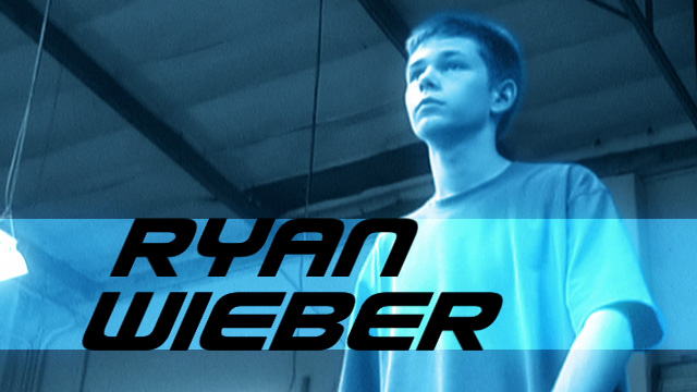
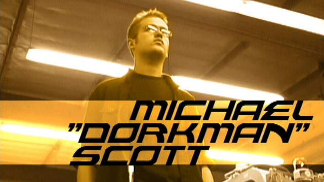
Ryan vs. Dorkman premiered to the web on March 1, 2003. With the release of the RvD2 Behind-the-Scenes DVD, the film has been made available for download, in full-resolution DVD quality for the first time.
For most viewers, RvD has never been higher quality than a highly-compressed YouTube video, which in turn was created from a highly-compressed Quicktime video. The highest resolution available was a 480x270 Sorenson 3 version, available at fanfilms.com.
A high quality release, on the other hand, deserves a high-quality master. So, as part of the preparation for the ultimate release of Ryan vs. Dorkman on DVD, the film has been given a full re-mastering from the original files.
This isn’t a “Special Edition”. Nothing has changed about the film, the quality has simply been upgraded to be more appropriate to the new medium, and to try to match the higher standards of image quality we established with RvD2.
The following pages will highlight some of the upgrades and adjustments that have been made to make the new RvD the definitive (and final) release of the film.
|
|
|
 |
|
 |
| |
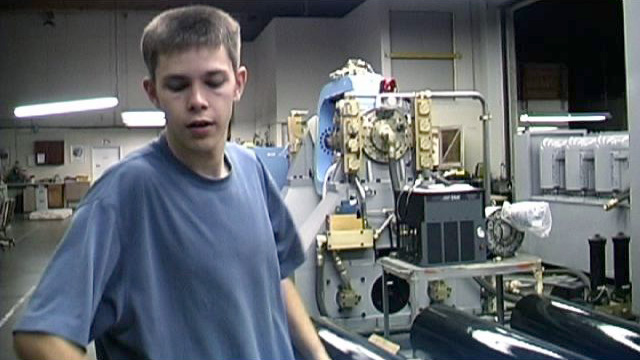
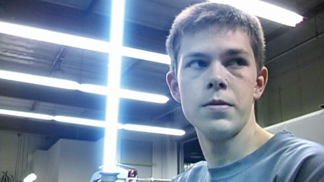
Interlacing Artifacts
RvD was created before we truly understood all of the technical aspects of shooting digital video, or video in general. One element that plagues many newer digital filmmakers is interlacing. A video signal, by its nature, is composed of approximately 30 frames per second, and each frame is split into two fields. The smooth, sharp motion of the higher effective frame-rate contributes to the so-called “video look”.
The film’s effects were accomplished via Adobe AfterEffects, version 5.5 at the time. The fields of video pose problems for effects work, and AfterEffects at this time, as a default preference, always assumed that video should be de-interlaced when imported.
Good for most video, but bad for us. We shot RvD on the Canon GL-1, which has a faux-progressive “Frame” mode which essentially did the de-interlacing and interpolation in-camera. The effect is a frame with no interlacing artifacts.
Importing this video into AfterEffects, however, the footage is de-interlaced again. Half the vertical lines of the image are discarded, and the remaining lines are duplicated to complete the image. This causes a significant amount of softness, and stair-stepping along diagonal lines:
During the post-production of RvD2, this old default came to light, and revealed its effects on progressive images. The change of a simple preference -- and a better understanding of video’s properties -- is remarkable:

Originally, the re-mastering of the film was solely intended to correct this artifacting. But as the project progressed, it became clear that the upgrades couldn’t end there.
|
|
|
|
|
|
| |
Color Correction
Early on during the RvD shoot, we attempted to have a consistency of the imagery by white-balancing to a piece of white paper. We quickly lost that practice as the shoot became more arduous -- and as we later discovered, we hadn’t been doing it properly anyway. Shot under fluorescent lighting, the film had an inconsistent greenish-yellow wash, which has been resolved by a shot-by-shot color correction to create a more neutral, consistent tone. It was also treated with a subtle “film look” to more closely mimic the richer contrast of film.
|
|
|
|
|
|
| |
Reframing
Though the final film is displayed at a 16x9 aspect ratio, the film itself was shot at the full 4x3 aspect of standard definition video. The result is a wide-screen image, with a great deal of margin to reframe the image vertically.
Throughout the film, the framing of some shots has been adjusted to create a more pleasing composition.
|
|
|
|
|
|
| |
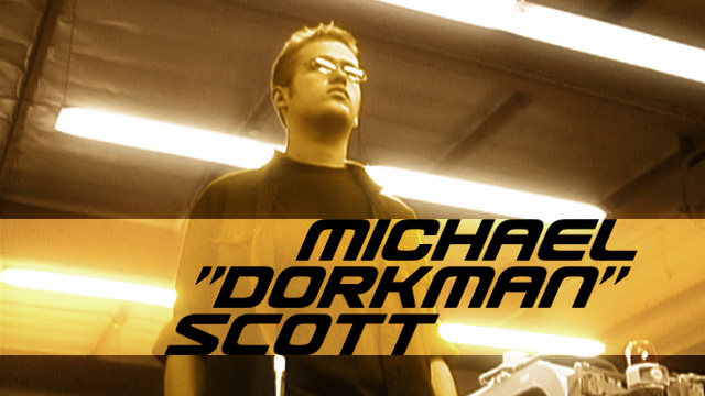
Opening Titles
The titles were originally created by Ryan, on a G3 Mac running OS9. The font chosen is an Apple default font from that era, which was lost in subsequent reformats and computer changes.
There are elements to the font that are somewhat undesirable, such as the inconsistency of line width and the way that curves terminate in sharp corners instead of any kind of gradual slope. For the remastered film, the lettering was replaced with another, similar font that did not have those drawbacks, still using Ryan’s original title animations.
Additionally, with a mind to the final delivery intentions of DVD, the titles were shifted to be within standard “title safe” boundaries.
As a final note, the period (.) was removed from the “vs” card, out of a sense of symmetry.
|
|
|
|
|
|
| |
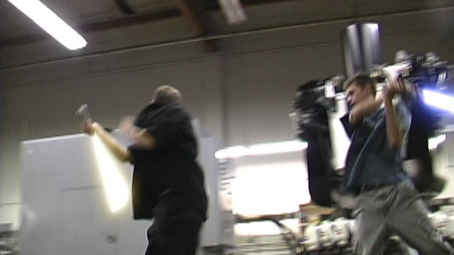
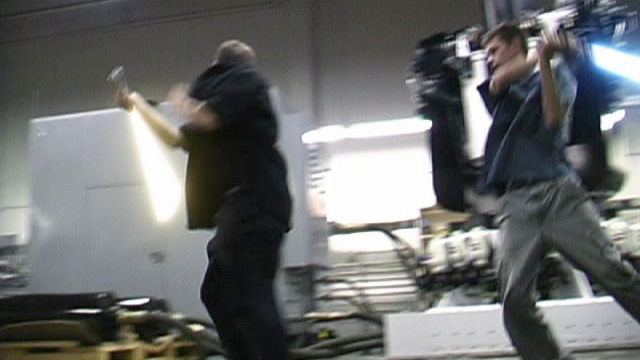
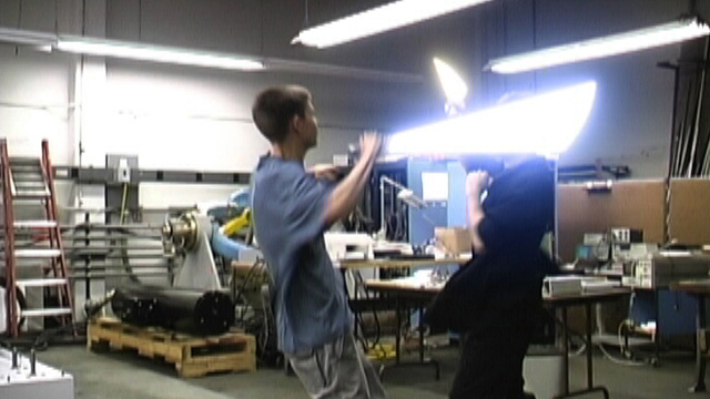
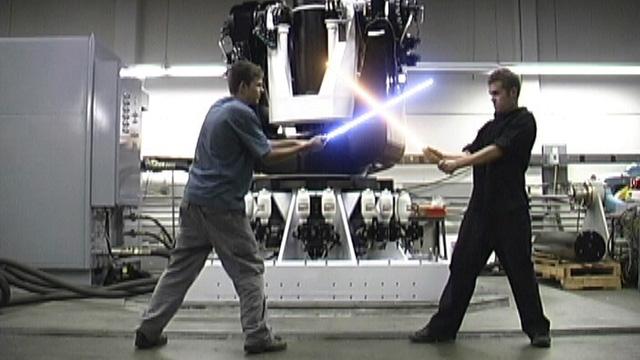
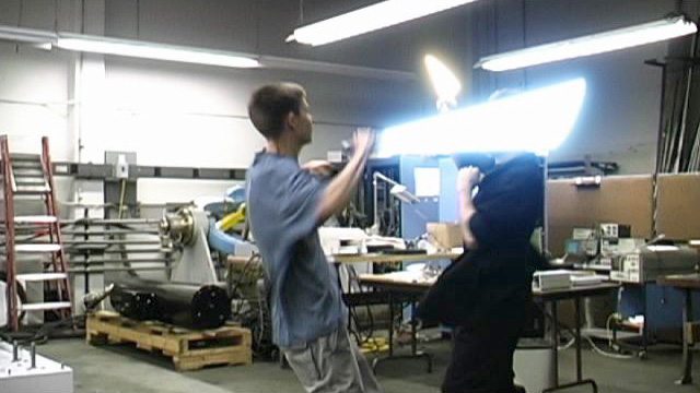
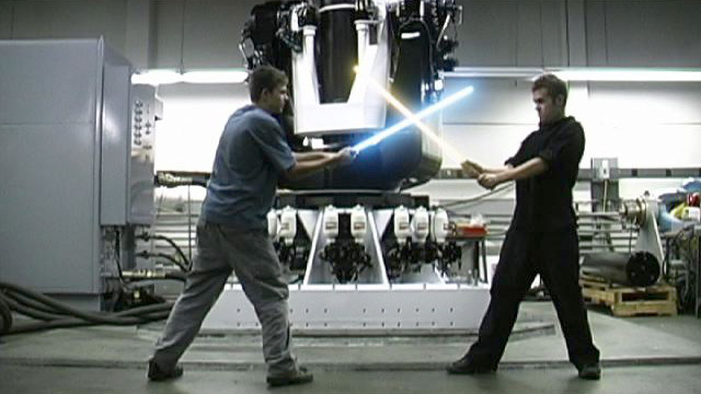
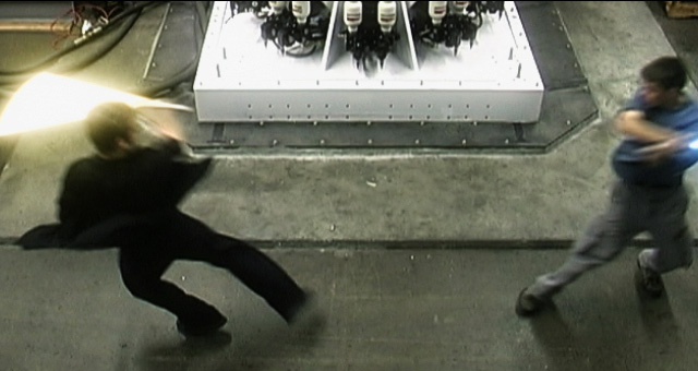
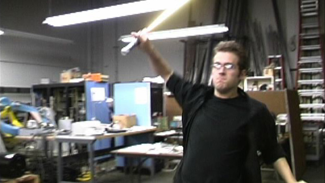
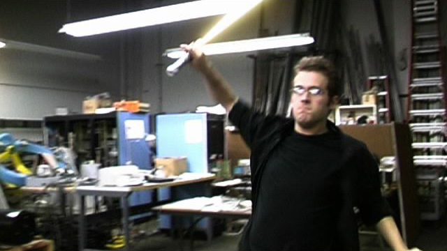
Lightsaber Effects
RvD, like its successor RvD2, was a true collaboration. We split the effects workload down the middle, and worked separately as we plugged away at our shots. Though the quality of the work is comparable, the results are not. From shot to shot the color, shape, and apparent brightness of our sabers could vary significantly:
Since all of the shots would need to be re-rendered anyway, it seemed like it would be worthwhile to create a consistency of style with the saber effects. Some shots were re-rotoscoped, and all of the glows were re-applied using the same process, and color values, that we had established in RvD2:
|
|
|
|
|
|
| |
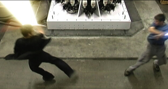
Rotoscoping Errors
The decision to re-do the lightsaber effects afforded an opportunity to resolve some errors that had been made under the tight original deadline for the film, which have been a favorite subject with some of our sharp-eyed fans. The lightsaber effect now appropriately covers the prop blade at all times.
|
|
|
|
|
|
| |
Digital Handheld
Several shots in RvD were shot on a tripod, kept perfectly still. Typically this was to facilitate some particular effect, though occasionally it was simply because there was no one available to hold the camera when those shots were taken.
In keeping with the rest of the film, and the philosophy of RvD2 (in which almost no shot appears entirely stationary), a subtle addition of camera “float” gives these shots a little extra life, more consistency with the rest of the film, and helps integrate the effects work.
|
|
|
|
|
|
| |
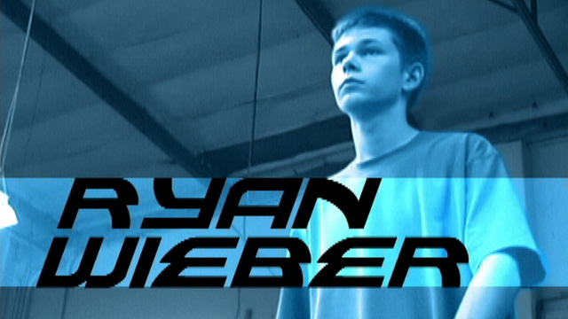
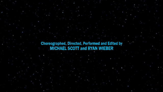
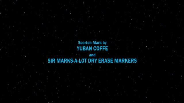
Credits
Since its release, the film has served as a valuable calling card for us, as a team and individually, but we were advised that the lack of an explicit “Directing” credit was confusing. The first title card has been revised to include a “Directed by” credit.
The credit for the effects work, removed from the first title to make room for the “directing” credit, has replaced a joking title card referring to Yuban Coffee and Sir-Marks-a-Lot Markers as the “providers” of the scorch mark.
The initial intention was to correct the misspellings of “coffee” and “scorch”, but under advisement that reference to these company trademarks could cause legal problems, they were removed entirely*.
*Yuban and Sir-Marks-a-Lot remain trademarks of their respective owners and do not endorse our film in any way. That was just the stuff we made the scorch mark with.
|
|
|
|
|
|
| |
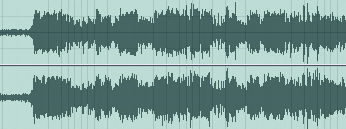
Soundtrack
Originally intended for internet release, the focus for the mixing of the soundtrack was speed of completion, and keeping filesizes small. Plus, at the time we didn’t really know much about sound production. As such, little regard was given to a high-quality mix. The sound is one long peak from beginning to end, and the final mix was mono sound.
With the DVD release, the soundtrack has been completely remixed from the source media to be less ear-splitting, and to provide a full stereo sound bed, including subtle panning effects, for your headphones or stereo sound system.
|
|
|
|
|
|
| |
We hope that you have enjoyed a look at the tweaks and adjustments that RvD has undergone, and that you enjoy the film “again for the first time” on your computer or television.
|
|
|
|
|

|
|
|
|
|

|
|